The Two Most Important Climate Plots in the World Right Now
A small change in average temperature can lead to big changes in extreme temperatures.
A consequence of our changing climate is a shift towards more extreme weather events. A rather impactful paper about this topic was published in 2012, titled Perception of climate change, led by James Hansen, prior Director of the NASA Goddard Institute for Space Studies. In the abstract of the paper, the authors write:
“Climate dice,” describing the chance of unusually warm or cool seasons, have become more and more “loaded” in the past 30 years, coincident with rapid global warming. The distribution of seasonal mean temperature anomalies has shifted toward higher temperatures and the range of anomalies has increased. An important change is the emergence of a category of summertime extremely hot outliers, more than three standard deviations (3σ) warmer than the climatology of the 1951–1980 base period.
Since its publication, a number of plots in the paper are regularly updated on a columbia.edu subpage. A recent update occurred in September 2023, which caught my eye and I have been thinking about it ever since. The more I thought about it, the more I realized that some of these plots are the most important climate plots in the world right now, in my opinion.
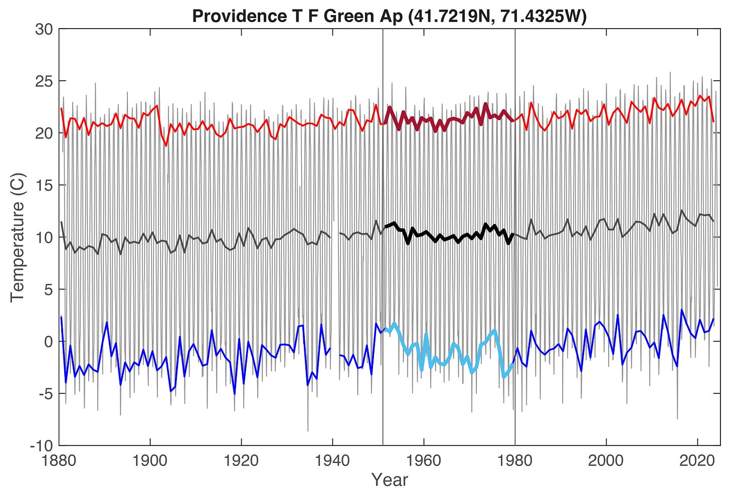
I spent some time recreating the “climate dice” analysis with my own code, to make sure I understood it, and to ultimately share it with you! To start, I randomly chose some data from the Goddard Institute for Space Studies (GISS) Surface Temperature Analysis (v4) database, known as GISTEMP v4. I ended up with temperature data for Providence, Rhode Island from 1880-2023 (see Figure 1 below). The figure shows monthly temperatures, but also seasonal mean temperatures for June-July-August (JJA; Northern Hemisphere summer) and December-January-February (DJF, Northern Hemisphere winter), as well as the annual average temperature.
Figure 1: Station temperature data (°C) for Providence T F Green Ap (41.7219N, 71.4325W) (adj - homogenized) ID: USW00014765. The black lines are monthly temperature data; the annual mean is shown as a thicker black line. June-July-August (JJA) averages (summer) are shown in red, and December-January-February (DJF) averages (winter) are in blue. The climatology of the 1951–1980 base period is shown between the two vertical lines. [plot: Tyler R. Jones, CC BY 4.0, data: GISTEMP v4]
Aerial photograph of downtown Providence, Rhode Island taken in 1951, the beginning of the base period in our analysis. [Wikipedia, Public Domain]
Aerial photograph of the Providence skyline taken by drone in 2022, a year with an extremely hot summer. [Wikipedia, CC BY 3.0, Sean McVeigh]
Before moving on, here is an ‘extreme’ and random, non-climate fact about Providence, pulled from Wikipedia:
Providence hosted the alternative sports event Gravity Games from 1999 to 2001, and was also the first host of ESPN's X Games, known in its first edition as the Extreme Games, in 1995.
And now back to climate. To think about how summer temperatures have changed through time in Providence, we need to understand probability distribution functions (PDFs). I personally think PDFs are one of the most powerful tools in climate science and statistics in general. PDFs look like bell curves, and tell us the likelihood of something occurring based on a data set. As an example, bell curves are often very good at describing the distribution of grades in a class. A few people get A’s and a few people might get an F or a D-, these are the tail ends of the curve with a low chance of occurrence. A lot of people in the class will probably get a C+, B-, B, or B+, described by the middle, fattest, and most-probable part of the bell curve.
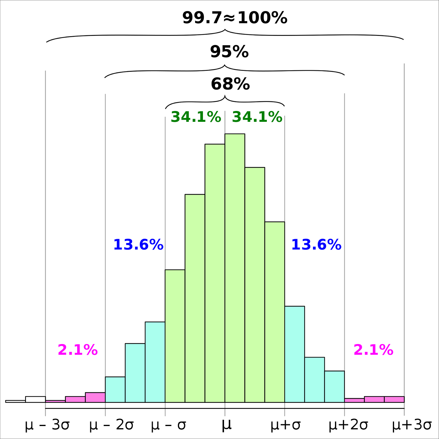
A good way to understand a PDF and a data set in general is to calculate the standard deviation, denoted by the sigma symbol (σ). The mean value is denoted by the mu symbol (μ). When the standard deviation is added or subtracted from the mean value, this is termed ±1σ (plus or minus one standard deviation), and 68.27% of the data will fall within this range. At ±2σ, 95.45% of the data will fall within this range, and at ±3σ, 99.73%. The 3σ Rule of Thumb states that almost all data (about 100%, but not quite) will fall within ±3σ, and anything outside of that would be quite rare, or you might say ‘extreme’. When searching for the Higgs boson, physicists used the 5σ level as their detection limit.
A histogram plot of an approximately normally distributed data set (meaning the histogram looks like a bell). The standard deviation is σ, and the mean value is μ.The vertical bars represent bins of data, and the taller a vertical bar, the more instances of data that occurred within a bin. Hypothetically, if this data set represented grades ranging from 50% (F) to 100% (A+), then each bin (20 total) would represent a range of 2.5%. On the far right side of the plot, the bin 97.5%-100% suggests only a few students achieved this A+ grade. On the far left, beyond -3σ (very rare), a few students received F grades of 50-52.5% and 52.5-55%. [Wikipedia, CC BY-SA 4.0, Melikamp]
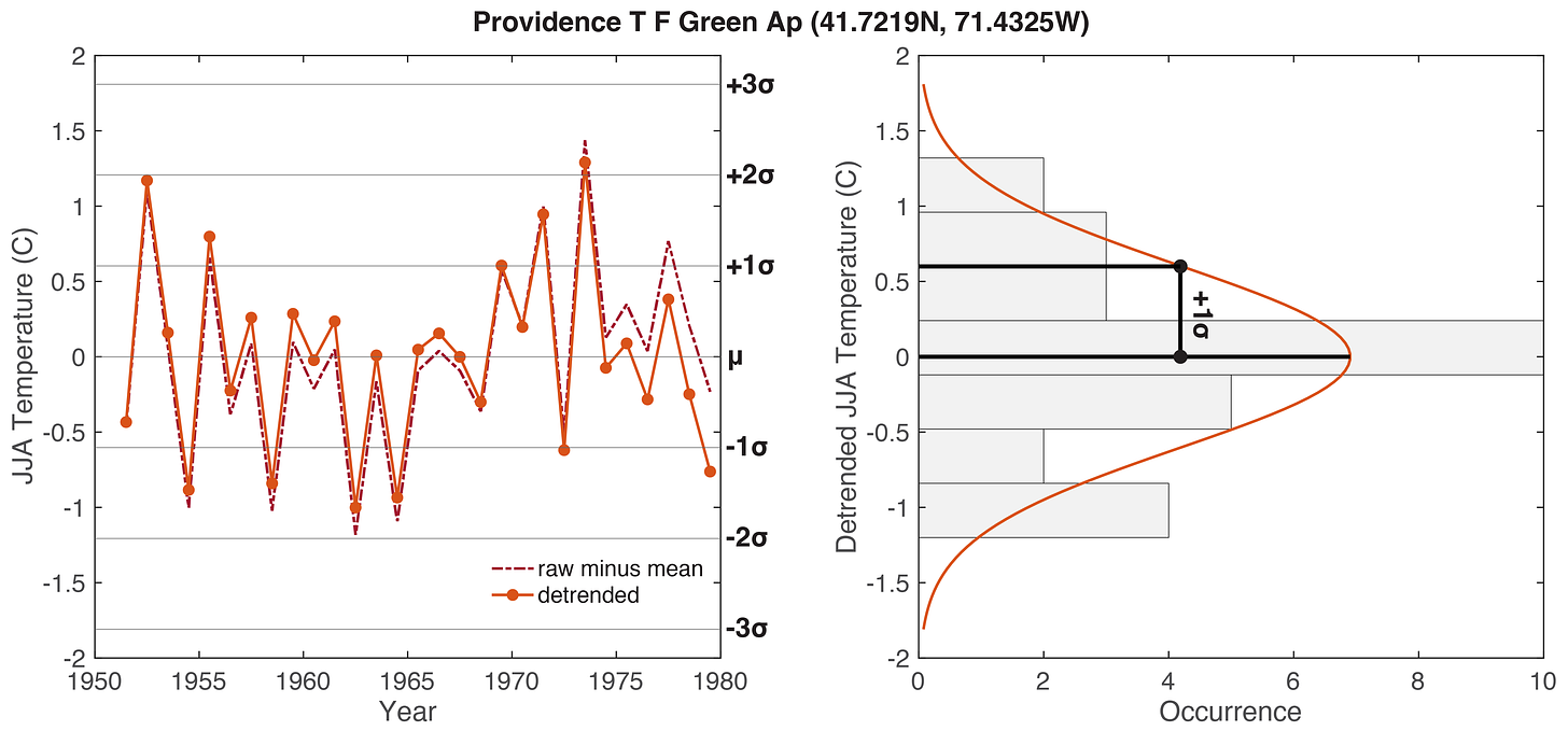
Let’s create our own histogram of Providence mean June-July-August (JJA) summer temperatures for the base period 1951-1980. First, I subtract the mean value calculated from all data from 1951-1980, which allows us to analyze ‘anomalies’. Values greater than 0 represent summers that were warmer than the mean (a positive anomaly), and values less than 0 represent summers that were cooler than the mean (a negative anomaly). What we see is that a lot of JJA temperatures fall within ±1σ, even more data falls within ±2σ, one value is greater than +2σ, and no values fall beyond -2σ or ±3σ. The result remains roughly the same whether I use the raw data, or if I detrend the data; that is, I remove the long-term mean trends that occur across decades, as done in the Perception of climate change paper.
Figure 2: (Left) June-July-August (JJA) summer temperature anomalies (relative to the 1951-1980 mean) for Providence, Rhode Island. The detrended data removes decadal trends in temperature. The mean (μ) and ±1, 2, and 3σ sigma levels are shown by the horizontal lines. (Right) A histogram (grey bars) and probability distribution function (PDF; red line) of the 1951-1980 JJA data. The +1σ value is shown. The ‘occurrence’ of data in the grey bars can be traced across to the data shown in the left plot, and the standard deviation values are the same in both plots. Note, the 1951-1980 base period was selected in the Perception of climate change paper because “global temperature was relatively stable and within the Holocene range to which humanity and other planetary life are adapted”. [plot: Tyler R. Jones, CC BY 4.0, data: GISTEMP v4]
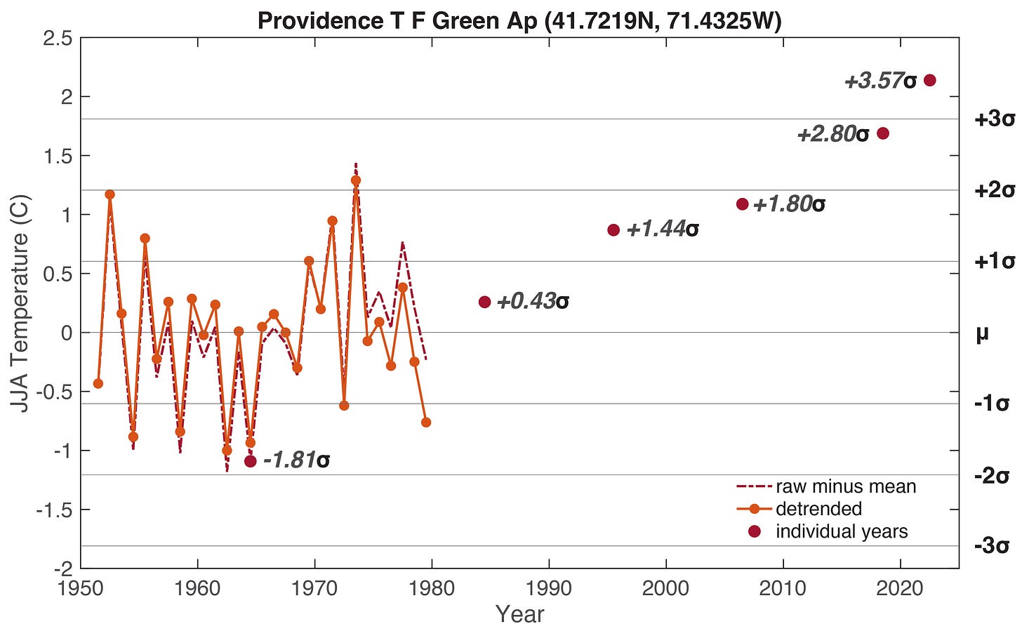
Now we could ask ourselves, how do JJA temperature anomalies for years after the 1951-1980 base period compare to the range of variability defined by the base period. I choose comparison years that are featured in the Perception of climate change paper (1964, 1984, 1995, 2006, 2018, 2022). A simple way to make this comparison is as follows:
The mean JJA temperature from 1951-1980 = 21.34°C (see Figure 1)
The standard deviation of JJA temperature from 1951-1980 = 0.60°C (see Figure 2)
The JJA temperature in 2022 = 23.48°C (see Figure 1)
The standard deviations above the baseline 1951-1980 climatology in 2022 =
(23.48°C - 21.34°C) / 0.60°C = +3.57σ (the value used in Figure 3 below)
So, for JJA summer temperature in 2022, we get a value of +3.57 standard deviations above the ‘climatology’ of 1951-1980. This means that in comparison to the recent past, when some Baby Boomers (1946-1964) and all Generation Xers (1965-1980) were born, the summer temperature in 2022 in Providence, Rhode Island was extreme, and as we will see below, extreme heat in summer is becoming more common globally, based on all available data. Generation Alpha (born 2013 – 2025) will probably never know the climate that prior generations enjoyed. We are entering uncharted territory!
Figure 3: Plot of the 1951-1980 base period for June-July-August (JJA) summer temperature anomalies, as well as anomalies for individual years analyzed in the Perception of climate change paper. The values next to the individual years are the standard deviations relative to the base period. The summer temperatures in 2018 and 2022 can be considered extreme compared to the recent past. [plot: Tyler R. Jones, CC BY 4.0, data: GISTEMP v4]
How does the rest of the world compare to Providence? This is where we finally get to discuss the two most important climate plots in the world right now.
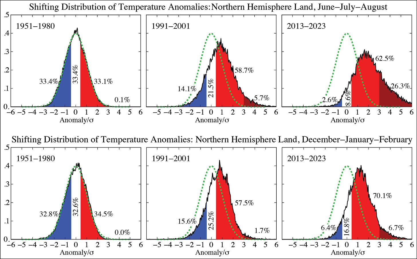
The 1st most important plot shows changes in the distribution of land-based (as opposed to ocean-based) temperature anomalies for June-July-August (JJA; summer) and December-January-February (DJF; winter) in the Northern Hemisphere, relative to the base period 1951-1980. We can assign a probability distribution function (PDF; bell curve) to the 1951-1980 base period, and then see how temperatures shift away from this distribution in more recent decades as the mean temperature increases. In summer, for example, +3σ anomalies (extreme heat) used to be very rare in 1951-1980 (<0.1% chance), but from 2013-2023 the chance of extreme heat increased to 26.3%. Notice that colder summers, compared to 1951-1980, have become rare as well. By shifting mean temperature by only a few degrees Celsius, we have created a climate where extreme summer heat is rather likely, and cooler summers are quite unlikely. Similar but less dramatic shifts are occurring in winter.
Shifting distributions of temperatures for JJA (summer) and DJF (winter) for Northern Hemisphere land areas. The green probability distribution function (PDF) remains the same in all plots for each season, corresponding to the baseline 1951-1980 climatology. The colors represent temperature: blue is cooler, white is neutral, red is warmer, and dark red is very warm, or extreme. [Source: columbia.edu subpage, originally from Hansen et al. 2012]
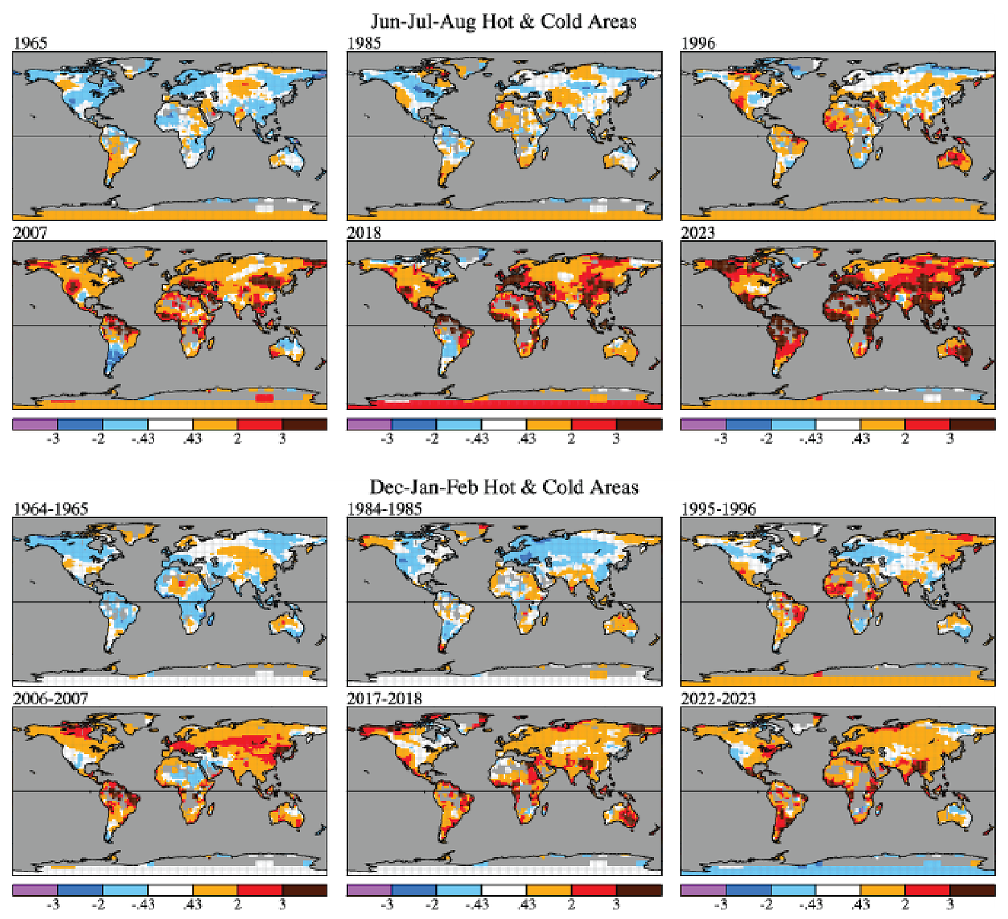
The 2nd most important plot shows the same analysis as Figure 3, but now for the entire world with 250 kilometer resolution (each little grid cell on the map below is 250x250 km²). For JJA (summer) compared to the base period 1951-1980, the year 1985, for example, exhibited some regions of the world that were about -1σ cooler than the local average, and others that were about +1σ warmer than the local average. Fast forward to 2018, and especially 2023, and large swaths of the planet now have summer temperatures that are greater than +2σ, and many areas that are also greater than +3σ, relative to the 1951-1980 climatology for each location. Providence, Rhode Island happens to be one of the locations with a greater than 3σ anomaly in 2022 (see Figure 3 above). The saying, “this record-hot summer might actually be the coolest for the rest of your life”, generally seems to be holding true and probably will be true for the foreseeable future, at least until humans get a better handle on climate change… which we will, I am hopeful.
Summer (top) and winter (bottom) temperature anomalies in units of the local 1951-1980 standard deviation. Dark red coloring, for example, corresponds to +3σ or greater anomalies. Keep in mind, while JJA is summer in the Northern Hemisphere, it is winter in the Southern Hemisphere - the seasons are reversed. [Source: columbia.edu subpage, originally from Hansen et al. 2012]
So, what does this all mean? By shifting climate to very warm and extremely hot summers, we create a high likelihood for things like drought and wildfire. But, if I had to pick one thing that might be most consequential to human well-being, it would be the potential failure of agricultural systems due to extreme heat. Our food supply is quite fragile, and our agricultural systems have not been adapted for extreme heat. This will become very important in future years and decades.
With that, we have come to the end of this newsletter. Thank you for reading. And please consider signing up for a subscription to Paleoclimate. I have lowered the cost of the 1-year subscription to the lowest allowable amount by Substack. How about it? Please subscribe.
Up next? We will see how sea level has fluctuated by enormous amounts over the last few hundred-thousand years.
All the best,
TRJ, PaleoClimate Scientist


